
About XPlore
Getting there is half the fun, Cunard said famously in a 1950's travel advertisement, and truer words were never spoken. There should be more to navigation than simply taking the user from Point A to Point B, and it is an idea that XPlore uses to set itself miles apart from the competition. The navigation app aims to do this by empowering its users in three ways.
-
Enhance user convenience through every step of the journey, ensuring that they remain in control until arrival.
-
Ensure user safety by not throwing any nasty surprises along the way, preventing motorists from being forced into making last-second manoeuvres that may threaten their well-being or that of others on the road.
-
Operate with complete transparency, providing the user with enough options to ensure that they get to their destination when and how they want to.
A question one may ask is: Don't existing navigation apps do this already? Well, they don't, and do read on to figure how XPlore serves to fill a tangible gap in the way existing navigation apps work.
How It All Began
I landed in Canada a couple of years ago, after working for over 10 years as a content writer/editor in the Indian media industry. Though I hoped to make a career change to UX Design, doing that entailed undertaking a certification course on the subject (and then creating a portfolio of case studies) while taking up a variety of survival jobs—ranging from data analysis for a prominent Canadian bank to warehouse duties at a courier firm—on the side. It was in my most recent job as a driver for a document storage and imaging company that I found myself depending on navigation apps like never before.
In the course of my work, I realized that while navigation apps are very helpful in getting one to hitherto unknown destinations, they also come with a bunch of issues that serve to make life extremely difficult for the user. So, step one involved identifying all such pain points a user may have.
Luckily, my job provided me with a sizeable pool of colleagues who were quite forthcoming in providing feedback on the navigation apps they use, and suggestions on how they can be bettered. I also interviewed a couple of office colleagues with desk jobs to gauge what the non-commercial driver may need from such a navigation app.
The Design Thinking Process
To create the XPlore app, I decided to adopt the Design Thinking Process as charted out by the Nielsen Norman Group. It involved five steps, i.e. Empathize, Define, Ideate, Prototype, and Test.
Empathize
I understood that an existing problem can be solved only if the designer empathized with the user, and in my role as a driver and logistics specialist, I had some first-hand experience on the matter. However, as I was also aware that solely depending on my own observations may not be adequate, I approached my colleagues for their views on the navigation apps they use and how they could be bettered. The users, in this case, were seven drivers aged between 22 and 50 years, and the questions I asked of them were similar to the ones I framed for the Bounce app.

Four of the drivers said they use Google Maps for navigation purposes, and one said he was more partial to Waze. I received adequate responses to the questions asked, and while I discarded some because they related more to the technical aspects of the apps, the ones I retained went a long way in helping me create and perfect a truly competent navigation application.
Pain Points
The following were identified as major problems faced by users while using navigation apps to get to their respective destinations.
Failure to specify favoured lane
Three of the five drivers interviewed mentioned that the navigation app they use does not hint clearly on which lane they would like the user to be in case they need to make a turn ahead. This becomes especially important when there is an immediate turn ahead upon entering a new stretch, and the driver is forced to make last-minute lane changes at great risk to themselves as well as other road users.

Navigation auto-completes even if driver has overshot destination
One of the main complaints voiced by all the drivers who use Google Maps was that the navigation app auto-completes even if the user has overshot the destination, either due to last-minute oversight or lack of parking space. The driver then has to start the navigation process from scratch, an exercise that may not be easy to perform especially if the vehicle is on a busy street.
Lack of proper route indicators
Another complaint voiced by the drivers was that conventional navigation apps make things a little confusing when it comes to finding the right route through a complex intersection with criss-crossing roads, and they occasionally end up taking the wrong road. This causes the drivers to lose valuable time, resulting in them having to take a more circuituous route to get to their destination.
Insufficient alerts when entering a one-way street
This is a problem mainly faced by drivers who are required to negotiate through a city's downtown zone, where two-way streets abruptly turn into one-ways or a left turn from a one-way street results in the driver ending up on the wrong lane of a two-way. Although Google Maps and Waze use no-entry symbols at the start of one-way streets to warn off motorists, they are easy to miss, and no alerts are sounded once they start going down the wrong way.
Google Maps doesn't show playground/school zones
Almost all the drivers claimed that the apps they use almost never alert them to playground zones, where motorists are required to slow down for possible children at the risk of being awarded a ticket.
Good to Haves
Most drivers claimed that while navigation apps fulfil the basic objective of getting motorists to their destinations, there are additional options they can introduce to make for a better motorist experience.

Route options
At present, navigation apps make motorists take routes that are deemed best for them through complex algorithms that take various factors into consideration. However, at least three of the drivers I interviewed were of the opinion that it would be great if they could provide users with options too. For instance, the navigation app could describe the various routes available to them, and ask them to choose between ones that involve highway driving that get them to the destination fast or traversing through interior roads that require slowing down to a crawl.
Vehicle description
Most of the drivers were also in favour of including a vehicle description page, where the user can insert details of their vehicles for optimal routing to their destination. For instance, if a driver describes their vehicle as a semi-trailer truck, the app will not guide them through routes that require passage through low tunnels.
Tourist mode
One of the users interviewed suggested the inclusion of a tourist mode, where the app provides a list of tourist attractions of their choice (for eg. historical, child-oriented, arts-focused) in any given city and then guides them on a merry sight-seeing trip.While this came from just one user, I decided to include the feature in XPlore as it would provide for a great fun dimension to an otherwise purely utilitarian application.
Define
Now that I had performed some user research, it was time to set some tangible targets for XPlore. For this, I had to chalk out some primary objectives that would set it apart from its competitors.
App Objectives
-
Keep users adequately informed about the route they are taking, adequately preparing them for abrupt turns, lane changes, and unexpected one-way streets. Provide one-touch shortcuts to info on nearby gas stations, hospitals, etc.
-
Allow insertion of vehicle details into the app for more personalized navigation, and make provision for users to mark certain streets as playground/construction zones.
-
Provide for users to post alerts on certain stretches, achieving the dual purpose of encouraging user participation and providing advance warning to others.
-
Double as a tourist guide for tourists, providing turn-by-turn directions to popular landmarks along with audio descriptions.
User Personas


Solutions
Now that I had performed some user research, it was time to set some tangible targets for XPlore. For this, I had to chalk out some primary objectives that would set it apart from its competitors.
-
Favoured Lane Alert: Constantly inform the user about the optimal lane to be in, so they can be prepared for sudden turns ahead. Similar to the Apple Maps feature, but easier to figure while on the road.
-
'On Until Complete' Navigation: Navigation continues if GPS coordinates indicate that the user has not stopped the destination, so they do not have to start from scratch if they have missed it accidentally or for some other reason. Once the trip is complete, the app should also check why the user failed to stop at destination (whether through user oversight; temporary obstacle like ambulance, fire truck, etc; or long-term obstacle like construction work), so others taking that route know what to expect.
-
Know Where you Are: Provide a close-up of a recommended left or right turn, so the driver knows which one to take. While it's understood that conventional global positioning systems cannot provide a close-up view of a turn in the road, a virtual rendition can be easily created through AI imaging with an estimate of the speed and direction being taken.
-
None Way: If the user were to enter a one-way street from the wrong end, they will receive a notification alerting them to their mistake as well as suggestions on the best way to rectify their situation.
-
User Markings: XPlore navigation will allow users to mark certain stretches as playground/construction zones, so others will know to slow down to 30 kmph in such situations. However, to be safe, these stretches will show up as marked only if a sizeable number of users attest to the same.
-
Route Options: If users wish, they will be allowed to choose between various route options to arrive at one suited to their needs. For instance, they could be allowed to choose between routes that involve freeway driving with tolls (for people wanting to reach the destination fast), freeway or regular road driving without tolls (who don't want to spend extra), or driving that involves negotiating lower speed roads and neighbourhood streets (for those who wish to avoid freeways because they are still on a lower rung of the graduated drivers licence program). Users would also be allowed to avoid entire localities altogether, especially if they find them problematic to negotiate (downtown areas, for instance).
-
Vehicle Info Input: Users will be encouraged to add vehicle details to the navigation app, so it knows which routes suit them best. For instance, if Darryl uses XPlore for the semi-truck as well as his personal Ford Escape SUV, switching between the vehicles will throw up customized routes suited for each.
-
Tourist mode: When on vacation to a new city, users will be allowed to choose between various sightseeing options. For instance, taking the 'historical tour' would open up a route connecting various historical hotspots in the city. Users will also get a brief description of each monument—including information on entry fees and parking zones—before actually getting there.
Ideate
XPlore User Flows
I had come up with an objective and targets were set, and now I was faced with the task of figuring out how exactly I was going to achieve those targets. Here are some user flows aimed at guiding the user to achieve four primary goals of the navigation app.
To create the user flows, I decided to focus to four primary objectives the user may want to achieve through the XPlore navigation app. These objectives were either essential to the app's functioning, or unique to it.
1. Navigate to Destination
This is a function that no navigation app can do without. XPlore, however, adds to it by customizing the journey to each user's needs, depending on the filters applied. That said, the user is at liberty to skip these steps if they so desire.
2. Access Driving History
This is a function that some navigation apps have, but is not executed effectively. XPlore will provide users the option to view the places they have been to, as well as the route taken to reach there.
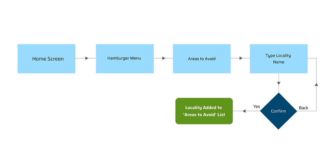
3. Specify Areas to Avoid
Through this feature unique to XPlore, users will be allowed to sidestep routes passing through certain parts of the city or town they live in. Because there are always a few motorists who would rather avoid the trickier parts of town.
4. Execute Tourist Mode
This feature is meant primarily for users visiting a new place, and are in the mood to catch the local sights.
NAVIGATE TO DESTINATION

Imagine that the user—let's call him Jimmy—wants to get to a certain location. He may need to pick from certain options (such as vehicle type and preferred route) before the navigation can start. That should not prevent him from having a smooth user experience, however, because he can either pre-select those options or simply skip them.

SPECIFY AREAS TO AVOID
Halfway through the day, Jimmy probably wants a lowdown on all the routes he has taken thus far. Or maybe he wants to check the route he took to a certain place five days ago. So, he clicks on the hamburger menu of the app and selects the Route History option.
.png)
TOURIST MODE
Jimmy abhors going through the city's downtown zone and certain areas where the traffic gets especially heavy and unruly. So he decides to avoid routes passing through those areas by adding them to his app's "Areas to Avoid" list. He clicks on the hamburger icon again, and selects 'Areas to Avoid'.
ACCESS DRIVING HISTORY

Rough Sketch
Jimmy is visiting Edmonton with his wife, and he has rented a car to tour the city. Where does he start, though? Luckily, the XPlore app has a handy 'Tourist Mode' option nestled conveniently under the hamburger menu.
I was now able to envision what the XPlore homescreen would look like, and the functionalities it would have. So I launched Figma and got down to create a rough skeleton of what I had in mind. It looked like this.

Wireframes
Then came the task of creating wireframes for what I believed were XPlore's most important screens. After doodling on paper for awhile, I set about creating these medium-fidelity wireframes on Figma.

1. Home Screen: This is where the XPlore journey begins. Step one would be to select the vehicle you would be driving that day, though this would ordinarily be preselected. Step two would involve keying in the destination. Next, the user gets to choose the kind of journey they want to have, but by checking the 'Pick the shortest route' box, the user can skip this part.
2. Route Options: Depending on the vehicle chosen, the user gets two route options. The first one is the fastest, which will take them through freeways and high-speed roads. The slower option, which is meant more for new or overly cautious drivers who want to avoid travelling too fast, takes them through neighbourhood streets and possible playground zones. The user has the option to skip this step by checking the "shortest route" box on the home screen, thereby choosing the fastest option.
3. Navigation Screen: Here, the user gets to see the route chosen for them. If happy with what they see, the user can tap on the start button. If not, they can tap on 'Other options' to return to the Route Options screen.
4. Tourist Mode: XPlore comes with a revolutionary feature that offers those visiting a new city the ability to choose between three kinds of tours i.e. Nature, History, and Nightlife. Each tour will take them on a well-charted journey covering all important hotspots in that category, complete with a running commentary and information such as ticket prices and closing hours.
4. History Tour (Example): Upon making their decision, an overview of the chosen tour opens up. Users can either go back to tour options, or skip certain stops from the itinerary.
Prototype
Now that I had created the skeleton, it was time to bring XPlore to life by bestowing upon it some much-needed character. To do that, I had to finalize the typography and colour palette for the app.
Typography
For headings, subheadings and more prominent bodytext, I decided to go with Saira, a sans serif font coincidentally inspired by vintage motorsport racing. This elegant yet future-forward font has nine weight variants, making it versatile enough for use in various scenarios.
.png)
For more regular text, I could find nothing more befitting than the tried and tested Roboto. An immensely popular font, the Google-developed Roboto enjoys a tremendous degree of compatibility with different systems and is optimized for readability on mobile phone screens.
.png)
Colour Palette
It was now time to add that drench XPlore in that mandatory splash of colour. But as XPlore's an app that's supposed to represent the landscape stretching before its users, I decided to restrict myself to colours representing the three elements of nature — blue, brown and green (in that order). Red would be used sparingly, mostly for highlights and occasional alerts.

1

2

3
Tools & Resources
Figma for App design


Unsplash for Image Sourcing
Photoshop for Graphics editing

Icons8 for Vector Art
Hi-Fidelity Wireframes
Once I applied my chosen colours and typography, the app all but roared to life!
However, while high-fidelity wireframes make for some pretty pictures, but what use are they if one doesn't get to see how they fit into the scheme of things? So, at the risk of repeating myself, I created the user flows all over again—but with high-fidelity wireframes instead of simple geometrical shapes showing how the app works.
SIMPLE NAVIGATION

The simple navigation function admittedly requires the user to jump through a couple of hoops before they can get down to the navigation part, but these additional steps serve to customize the experience for them in a way no other app can. For instance, if the user picks the semi-truck instead of the car, they will be taken down routes that steer clear of low overhead bridges and narrow streets. Here, the user is also provided with two route options—fast takes them through freeways and high-speed zones, while slow (meant for new drivers or the more cautious) takes them through school zones and neighbourhood streets.
EXPRESS NAVIGATION
AREAS TO AVOID

But what if the user doesn't care for route options, and would rather pick the fastest way to get to their destination? In that case, they just need to have their vehicle pre-selected and the 'pick the fastest route' box duly checked.

There are some parts of town all of us prefer to avoid, whether it's confusing downtown or that particular area plagued with tricky intersections and unruly drivers. XPlore provides the user with the freedom to blot these areas out of their maps, so they never need to navigate their way through one of those places again!
TOURIST MODE

So you are a tourist visiting a new city, and you would like to avoid the bother of looking up various sightseeing options and then figuring out how to get to each of them. XPlore has an answer for that, neatly tucked away in its hamburger menu! Besides providing you with three touristy itineraries of History, Nature and Nightlife, complete with navigation options and travel information, it allows the user to skip any stop in accordance with their personal preferences and schedule.
OTHER OPTIONS

There are times when one needs to look back into their past, and check all the places they have been to and the routes they have taken. Through its Route History option, XPlore provides one with all the information they need at the tap of a finger, whether it relates to that particular day or a certain date in the years gone by. Or maybe they just need to save the locations they have been to, everything categorized conveniently, so they aren't too tough to locate later. This is where XPlore's Saved Locations feature comes handy.
Salient Features
Now that I had the UI finalized, it made sense to go over XPlore's most important on-road navigational aids again. The foremost among these was the close-up view of turns, a feature that will make wrong turns a thing of the past.

And then there are those dreaded one-way streets. Something simply had to be done about them.

Remember all those times when you were asked by your app to take a sharp right when you're doing 80 kmph on the left-most lane of an exceptionally busy street?


Video Demonstration
If pictures speak a thousand words, videos speak five thousand more. Here's a YouTube video to demonstrate exactly how XPlore means to make your time on the road much easier.
Interactive Prototype
Finally, here's the most interesting part of the XPlore case study—the interactive prototype! Set a distant destination as your target, and click on the image below to embark on your most intuitive navigational experience yet.

Testing
I tested my XPlore interactive prototype on a user pool of five people, comprising three professional drivers and two colleagues who use their vehicles primarily for commuting and running errands. There were asked to perform six tasks crucial to the app:
-
Navigate to Crossriver Mall using the basic navigation function, and accept responsibility for a botched turn ('Oops! That was all me') in the feedback options that pop up upon completion.
-
Figure out the 'Express Navigation' function and use it to reach the destination provided (Crossriver Mall).
-
Find Habiba's restaurant in the 'Pubs & Restaurants' section of Saved Locations.
-
Find the Route History option, and figure out how much distance the user has covered so far that day.
-
Add Downtown Calgary and Marda Loop to XPlore's 'Areas to Avoid' list
-
Find the Tourist Mode feature, and make a note of all the tourist attractions its 'History' option.
All the users completed their tasks successfully, without a major hitch, but two correctly pointed out that the effectiveness of the navigation method itself can't be properly judged until it is tested on a city street with live traffic. That said, everybody in the pool was of the firm opinion that the features incorporated (such as close-ups at turns and preferred lane indication) stand to minimize confusion during the navigation process and play a major role in getting users to their destinations safely.
Conclusion
In many ways, the XPlore app is my response to the various difficulties the typical urban motorist faces when using a navigation app to reach their destination. However, using these apps also helped me understand what they got right, both in terms of aesthetic design and functionality, and I made it a point to incorporate these very factors in XPlore. For instance, most of the users I interviewed found the colour palette of Google Maps better than that of Waze ("more soothing and grounded"), so I tried to adopt a similar chromatic philosophy in this app.
What would I do differently if I were to start on the XPlore project all over again? Well, the interactions with the people in my user pool during the research and testing phases were informal and strictly vocal (mostly executed during lunch breaks and the occasional free moment between tasks), and if I were to commence from scratch, I would probably do it the questionnaire way. That would provide the respondents with more time and mind space to articulate their observations and feedback, and thereby help me mould XPlore into an app that does an even better job of addressing their navigational issues.