
What is Bounce?
Think Netflix, YouTube, IMDB, and Facebook, all wrapped neatly with a bow in a fun yet ridiculously user-friendly package. Bounce Unlimited is a mobile application that aims to take the video streaming experience to a whole new level through ways yet untapped by existing players. These include provisions to:
-
Filter media content down to exactly what users want to watch at that point in time.
-
Rate and review movies/TV shows, and engage in active discussions with fellow users without having to venture away from the app's ecosystem.
-
Provide performers and more artistically inclined users with the exposure they need to become Internet celebrities.
-
Connect users with each other, forming an online community united in its love and loyalty for Bounce.
Seed of an Idea
Bounce finds its origin in a bitter user complaint from my spouse (let's call her A) one Friday evening, while she was engaged in a fruitless hunt for a watchable movie across three popular streaming platforms. She acknowledged that each of them offered tonnes of material for her viewing pleasure, but having to sift through all of it without an intuitive filtering mechanism in place was close to impossible. And no, A didn't care much for the "recommended" or "popular" content that the streaming apps kept pushing onto her.

This, I realized, was a UX problem. User interests vary, and the streaming platforms they use do have enough media content to cater to all of them. The problem lay in the absence of an efficient system to get them what they want when they want it.
Still, ineffectual filtering was probably just one of the many issues that plagued contemporary streaming applications, and since I was looking for a UX project to execute, it made sense to identify every such concern and then design a platform that addressed them.
In the spirit of starting with a minimum viable product, I decided to first design Bounce as a mobile application, and adapt it to desktop and television as and when the occasion should arise.
Design Thinking Process
There was no way I could identify every user pain point vis-a-vis streaming apps without doing some UX research. It was, after all, the first step in the Design Thinking Process that had to go into the creation of Bounce.
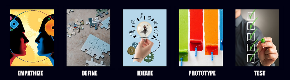
Empathize
The solution to an existing problem, I believe, can be found if one steps into the shoes of a potential user. I did that by seeking answers to two basic questions from a set of eight individuals (my spouse, four office colleagues, and three people from my immediate neighbourhood) ranging between 25 and 42 years of age. The questions were:
-
What are the biggest problems you experience while using existing streaming platforms?
-
Is there any feature you wish you could add, or change, about these applications?
While the questions appeared contextually broad, they flung open a revelatory floodgate of unfulfilled expectations that users have from media streaming applications. They also provided me with an insight into the various USPs I could incorporate into Bounce, so as to give it an edge over the competition in terms of functionality and user-friendly design.
Pain Points

The following were identified as the biggest problems users faced while using the three most prominent media streaming applications in Canada, namely Netflix, Prime Video, and Disney. The first concern (about the user's inability to zero in on desired content) had already been acknowledged, but there was a need to dig deeper into it.
Ineffective filtration system: The primary issue cited by A was echoed by every single member of my user research pool, giving credence to my argument that an efficient metadata-based filtration mechanism was the one thing lacking in existing streaming apps. Consequently, this gave rise to three primary issues that worked to the detriment of all the parties concerned.
-
Users are unable to find the content they desire, simply because it vanishes unnoticed into a virtual whirlpool of media they don't much care for.
-
Thousands of TV shows and movies go under the radar soon after landing on the platform, and upon failing to accrue the required viewership numbers within a certain period of time, eventually get the axe.
-
The home screen of the app comes under undue pressure in terms of content exposure, because in the absence of a proper filtration system, it is the primary place where viewers come to find new content. And no, it is impossible to exhibit everything on the home screen.
No in-app rating/reviewing option: At least two users complained about none of the streaming apps providing a provision for users to rate or review a video after they have watched it. This works to the app's disadvantage for two reasons.
-
The user has to exit the application, or at least minimize it, in order to check a movie or TV show's ratings or reviews on a third party platform. Repeating this process for multiple videos can be very annoying.
-
Both the users who raised the issue claimed that over 40 per cent of the times they closed a certain streaming application to check a video's ratings on IMDb, they ended up finding another movie or TV show from its "More Like This" section that was eventually watched on a rival app. This led me to believe that an in-app rating/reviewing option would help prevent viewers from getting distracted or straying away from the app's ecosystem.
Happy to Haves

The users I interviewed also went beyond mere grievances to point out important features from media sharing platforms, social media applications, and discussion forums that could be incorporated in the app to make it more interactive and, on occasion, profitable for users while building an online community united in their love of entertainment. With the help of their suggestions, I made a list of some features that I thought would definitely help Bounce become a more well-rounded app than its competitors.
User Uploads: This idea was suggested by a 35-year-old neighbour who regularly posts videos of her dog on TikTok. Why can't one have a user video category in a streaming app, she asked. While this was a suggestion put forth by just one person in my user pool, I decided to include it in my app due to two major considerations.
-
Having a feature that allows the uploading and viewing of user videos would enable Bounce to enter a whole new area of business, pitting itself against popular videosharing platforms such as YouTube and Vimeo. It can piggyback on the popularity of the app's video streaming segment, garnering both viewers and influencers in record time.
-
Providing people with an option to upload and exhibit their videos—dance, music covers, skits, homemade short movies, self-help videos—would enhance user involvement in a big way, and eventually get them to start identifying with the app. Take YouTubers, for instance.
Discussion Board: A majority of the people interviewed pushed for the addition of a discussion board to Bounce, just so they could discuss a movie or TV show they have just watched with fellow users. Doing this, I gathered, would be advantageous for the app in two ways.
-
The main purpose—and the more obvious one—is for viewers to discuss a certain video amongst themselves, whether it's to make queries, seek recommendations, or even express how much they liked or disliked it. This would work differently from the review section, where full-fledged interactions between users wouldn't be possible.
-
Incorporating a discussion board will encourage user participation in the working of Bounce, forming an active online community that's faithful to the brand. This will greatly help the app from a business perspective.
Define
Now that I had an idea of what potential users may expect from Bounce, it was time to set some targets. Such as, what objectives do I want the app to achieve in terms of user needs. And how stakeholders can hope to gain from such a venture.
.png)
User Personas
On the basis of the people questioned, and answers received, I created a set of three user personas. These characters may be fictional, but they are a very realistic representation of the people I interviewed, complete with the grievances and aspirations they harbour.
The Busybody

Miss Creative

The Social Animal

My Inferences
Taking cognizance of the opinions expressed by my user pool, I decided to incorporate the following features in the app.
A Mix 'n' Match Filter System
This revolutionary filter system would allow users to combine two or more genres in the movies, TV and music categories, allowing users to zero in on their content of choice more efficiently. I initially had only a vague idea of how this would work, and the feature was perfected through relentless reiteration.
User Video Upload
This feature would allow users to upload videos in various categories, including dance, music, experiences, and pets. The navigation menu will have a direct upload option, while the home screen will provide direct access to the user video section.
Content Rating/Review Feature
A dedicated button on the video info page will allow users to view reviews and ratings posted by peers, as well as IMDb/All Music scores. Once on the review page, they can post their own ratings/reviews.
Discussion
The video page info will also have a link leading to a discussion board, where users can ask questions and respond to them, or simply express their opinions on a movie or TV show. Unlike the review section, they will be able to actively converse with each other.
Ideate
Now that had an idea of what I was going to design, and who it would be for, I had to put the app's likely processes on paper (in this case, an Adobe XD artboard). These were done through a sitemap of all the app processes starting from the registration stage, and user flows depicting Bounce Video’s primary functions.
Sitemap
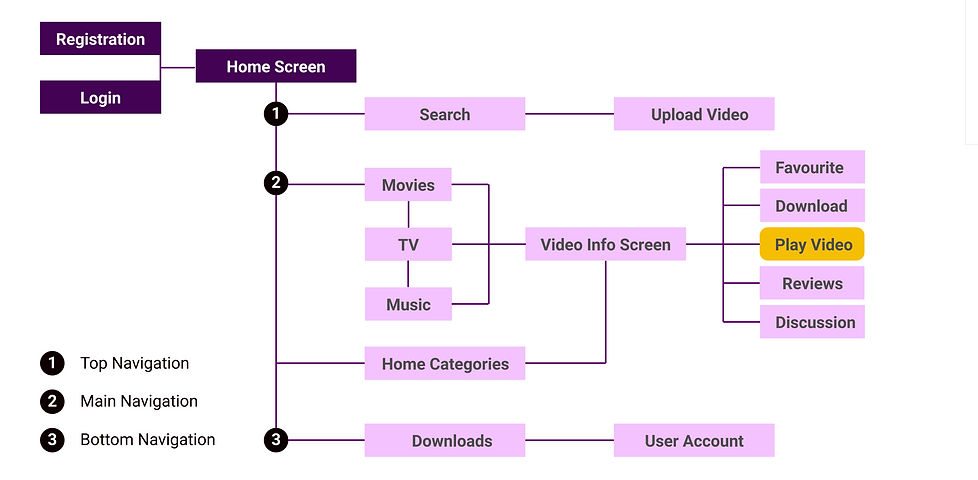
User Flows
The user flows included here involve one action that will likely be used most often by users, i.e. watching a video, and three others that are exclusive to Bounce. Those pertain to uploading a user video, writing a review, and mixing and matching genres in order to better filter content.
Watch a Video

Upload a User Video

Write a Review

Mix 'n' Match Filters

Lo-Fi Wireframes
Based on the user flow charts, I created lo-fi wirefames for the rating/review submission, user video submission, and mix-and-match filter screens. This is how they looked.
Home Screen
The Home Screen is the face of the app, and therefore, one of its most important aspects. I designed it similar to most streaming apps, in keeping with convention, showcasing movies under categories such as 'Just Added', 'Most Popular' and then going on to list the best in the most popular genres. However, given how important user videos are for Bounce's overall business strategy, the best in this category are showcased right under the hero carousel, and in a manner that makes them pop. A direct link to upload user videos is also included in the mobile navigation bar.

User Video Submission Screen
What: A feature that allows users to post their own content (movies, web series, skits, and music/dance clips) on Bounce Video. The content will be subjected to an automated screening process to prevent misuse, abuse, or copyright infringement.
Why: The stars are out there, sometimes you just need to be able to see them. And what better way to do that than provide an entire universe of users with the opportunity to let their creative juices flow on Bounce. Considering that this is one of the main USPs of Bounce, the user video submission feature is positioned on the mobile navigation menu for easy access.

The Ratings/Review Submission Screen
What: A screen that enables users to provide feedback on available media through reviews and ratings. After submission, the user's write-up will be visible on the main reviews screen.
Why: Allowing in-app ratings and reviews allows users to decide on what movie or TV show to watch immediately, without going to the bother of consulting third-party websites. It also retains users in the Bounce ecosystem, shielding them from distractions that may cause them to stray.

The Mix 'n' Match Filter Screen
What: This feature allows users to combine two or more genres to categorize the content in a way that a regular filtering mechanism just wouldn't allow.
Why: A streaming app may have loads of content, most of which are a combination of different genres, but bringing it to the user's notice is always a challenge. For instance, present streaming apps have different rows denoting genre combinations on their category pages, such as 'Horror Comedy' or 'Sci-Fi Action', but this forces the user to scroll down endlessly until they find what they need. Even so, if the user wants something more specific in a genre combination, such as 'Zombie Comedy' in the 'Horror Comedy' segment, they either have to scroll down another seemingly endless screen of rows or, worse still, find what they need from a clutter of results thrown at them. The mix-and-match filter I devised aims to help users locate the exact content they are in the mood for at the tap of a button, without having to wear their fingers or patience out through endless scrolling.
I had to go through a few reiterations at this stage. As I only had an idea of how the filteration process was supposed to work, and hadn't arrived at a complete understanding of how to go about it, I first tried to create it using a collapsible menu model. The screens, at that point, looked something like this.

However, owing to lessons learnt from the previous Paws A Minnit project, I decided to seek user feedback on the app design at this stage instead of later. I approached two users from the research pool and separately sought their opinion on my content filtration model. While both seemed to appreciate the concept of a 'mix and match filter', they were unanimous in stating that as users, they were unlikely to bother utilizing a 'boring' collapsible menu to zero in on their content. There was no doubt about it: My content filtration system required a relook.

A few days later, I approached them with a different design that could be accessed from the main navigation menu. They seemed much happier with the revamped version.
The Home Customization Screen
What: What if you are a user with a very specific taste, and that row of gory horror movies on your home screen every time you log in really puts you off. The Bounce homescreen customization allows you to do away with the offending row with the slightest squeeze of a finger.
How: To delete a certain category on your homescreen, simply long-press on the selected row to have a prominent delete symbol (denoted as 'x') pop out. When tapped, the row disappears, prompting the one below to slide into place. These changes, however, are not permanent and can be undone by accessing the app settings option.

Prototype
After having created Bounce’s skeleton, going mid-fi seemed to be the most logical step. I had zeroed in on some of the buttons and icons that were to be used in the project by then, so I could afford to dress it up a little.

Mid-Fi Wireframes
Moodboard
Now that the body of Bounce had been put on paper, I was faced with the task of creating its colourful soul. I scoured the Internet, especially that very helpful muse called Pinterest, and came up with an exquisite collage of dark and light.

This, in turn, helped me understand the colours and fonts I would need to apply the crucial final touches to the Bounce app.
Typography
In terms of fonts, I decided to go with contrasting characters to reflect the diverse aspects of Bounce. While I used Nirmala UI, a unobtrusive sans-serif font and a daintier cousin of Roboto in terms of appearance, for bodytext and secondary/tertiary headlines, Impact—with its loud, daring industrial feel—seemed best suited for the primary headlines. For buttons and certain links, I went with Agency FB to give the app a futuristic touch.
Tools & Resources

Colour Palette

And, of course, there was the greyscale palette. Basic shades of black and white, but without which no user interface design can be complete.

Hi-Fi Wireframes
Now that I had determined the nitty-gritties of my design and even designed the UI elements, it was time to put them all together to see what the finished product would look like. It was like varied pieces of a jigsaw puzzle latching onto each other to form what I had on my mind all along.


Final Screens


Bounce Highlights
So I finally had everything ready, from Bounce Video’s origin story to mockups of its user interface, but I still felt the need to showcase how and why it stands out from the competition. Here is a short video to demonstrate what makes this app click.
Interactive Prototype
A video can show how things work on the application, but it is no substitute for the hands-on experience that a working prototype provides. Here is a link to the interactive prototype of Bounce Video. Most of the links and functionalities work, so do feel free to tap away like you would on an actual app!

Customize the Homescreen
While one expects the user to watch movies and TV shows of all genres, that is often not the case. On many occasions, they are irked to find entire rows of content they would likely never watch exhibited prominently on the home screen. Here's a demonstration of how the user can hide such rows on Bounce, thereby gaining quicker access to content they like.

Test
After completing the project, I approached the same set of eight individuals with Bounce Video’s interactive prototype and asked them to carry six essential tasks. These were:
-
Find the Action Movies category screen on Bounce App.
-
You want to quickly upload a user video onto the app. Find the link for the same, and return to home screen after completing the task.
-
Combine the “Action” and “Comedy” movie categories using the merge button, and locate the “Buddy cop” subcategory on the results page.
-
Write a user review for the “Breaking Bad” television series.
-
Start a new discussion topic for any TV show or movie you like.
-
Find the “related videos” screen for The Sopranos television show.
Results: While the test subjects in my user pool were able to complete most of the tasks listed above, three faced initial difficulties using the “mix-and-match filter” function. However, they managed to figure it out quickly enough after watching the Bounce Highlights video.
Conclusion
I was able to put a couple of lessons learnt from my ‘Paws A Minnit’ experience to use on Bounce Video, thereby sparing myself a few pitfalls along the way. A case in point is the design I created for the “mix-and-match filter” function, for which I sought user feedback early, and—consequently—was able to change for the better before things had advanced to the UI phase. My work on Bounce Video made me understand the importance of holding the user’s interest as they journey through the mobile app, and that meant not just the content on offer but also its interface design and functionalities.
What would I do if I could work more on the app in the future? Some highlights of this app, such as the 'mix-and-match' and 'delete a row' features, are fairly pathbreaking and would therefore require subjecting users to a 'Getting Started' tutorial. If I had to further improve on this app, I would try and look for intuitive ways to familiarize users with these features without having to resort to a tutorial.